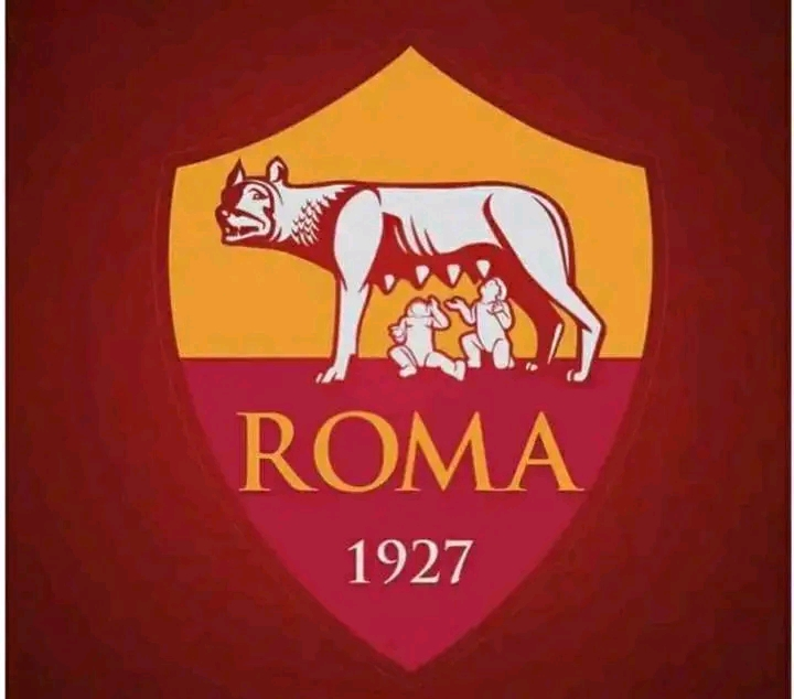
AS Roma unveil their new logo! 💛❤🛡
AS Roma New Logo Unveiled: A Modern Evolution of a Classic Crest
Bold Updates Define the Future of AS Roma’s Identity
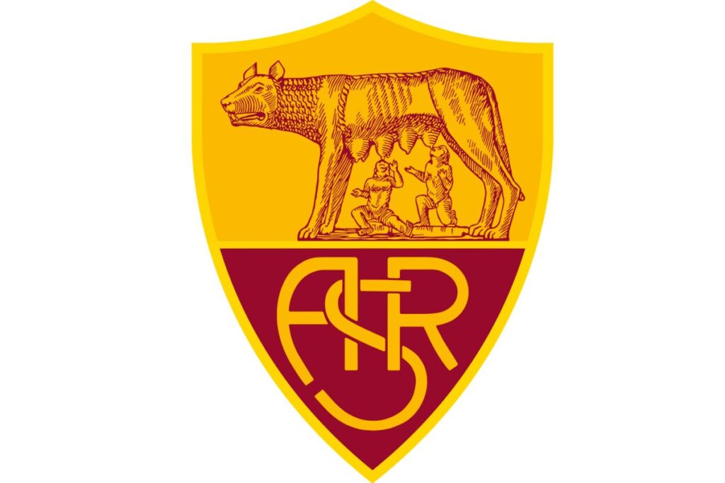
AS Roma has officially revealed their new logo, marking a bold evolution in the club’s visual identity. The redesigned crest maintains the rich traditions of the club while introducing a modernized aesthetic tailored for a new generation of fans. The updated emblem simplifies the iconic she-wolf and twins imagery, enhances the typography, and introduces cleaner lines for a sleeker appearance.

The AS Roma new logo reflects the club’s ambition on and off the pitch. While staying true to the historic symbols of Roman heritage, the redesign aligns with contemporary design standards, making it more versatile across digital and merchandising platforms.

Why the AS Roma New Logo Matters
This is more than a cosmetic change—it’s a strategic move that strengthens AS Roma’s global brand. For fans, it’s a point of pride. For the club, it’s a refreshed emblem that connects Rome’s legacy with a global football future.
Whether you’re a lifelong supporter or a design enthusiast, the AS Roma new logo is worth examining. The clean lines, refreshed layout, and preservation of Roman mythology ensure that the spirit of the Giallorossi lives on.
Related: Serie A


